phone: 856-433-0608 | email: media@digitalxwebs.net


 Success Grows With Us
Custom Design Is not cookie cutter, click and paste. Custom designed - to fit all screen sizes. Custom designed to utilize your company colors, look and feel.
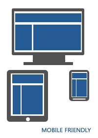
By default Digital Xpressions creates a site that is mobile friendly, which simply means the website is developed so that the look, feel and features function relatively the same on both computers and portable devices, such as phones and tablets.
There are other options for mobile devices that are available for your mobile website. Depending on your audience, goals and budget will help determine the best option for your mobile website.
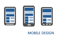
Mobile design is perfect for those targeting mobile users of their website.
Designed specifically to fit smart phones.
Only mobile phone users will see this version.
When an average of 50% of website page views come from a mobile device, mobile surfing is rapidly growing and targeting a specific audience.
According to @similarweb, Mobile now drives 56% of all traffic. Mobile drives more traffic worldwide, but desktop users spend more time on a site and mobile has a 40% higher bounce rate across the web. Mobile drives the most traffic, but desktop still wins for site engagement.
What difference does it make?
How can this data be used to inform of your digital marketing strategy?
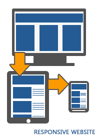
Making sure that your site is responsive and that means, tablet & mobile ready. Knowing that between 40% to 70% of your visitors are coming through a mobile device - mobile can't not be treated as a second priority.
Which means that now is the time to start thinking about the mobile design and scale it forward to desktop. And knowing that desktop still carries the higher engagement, could be due to mobile design not being planned up front.
Planning mobile and having a responsive website means that your mobile pages will be Search Engine Optimized - and during this year Google changed their rankings on their crawl of mobile sites, and not their crawl of desktop sites.
Don’t Forget the Desktop! Data shows that most conversions still happen there, so your desktop experience is still critical to overall business success. Paying more attention to mobile does NOT mean that you should ignore the desktop.
What option is the best for your business, relies on your business goals and marketing agenda.
Contact us today for a FREE consultation!
We work with you, so your mobile website works for you.
Please feel free to contact us for a free initial consultation or additional information. We'll be happy to assist you and answer your questions.